ROLE
2019-2025 YOR HEALTH
Founded in 2008, YOR Health is a system of nutritional products designed to support energy, digestion, and overall health through easy, daily routines. I joined during the brand’s new sport-focused launch and later refreshed it into a refined lifestyle brand with a luxury flair that reflects premium ingredients and everyday wellness.
After research and analysis, we determined that the consumer knows they should be healthier, but lacks the time, consistency, or knowledge to do it right. They feel overwhelmed and inconsistent, lacking a simple, trustworthy daily system that actually sticks. The athletic-focussed positioning further intimidated the customer, which led to its premium evolution and Amazon launch.
Brand Refresh
Creative Strategy & Direction
Campaign Development
Digital Marketing
Photo & Video Direction
Copy Writing / Content
UI Design


GOALS
-
Evolve the brand into a more modern, premium lifestyle presence while maintaining existing packaging and logo
-
Simplify complex nutrition benefits into clear, engaging, easy-to-understand visuals
-
Support Amazon launch with conversion-focused PDP and campaign creative
-
Build and execute campaigns across digital channels to drive awareness, retention, and win-back
MY PROCESS
I started by researching the full brand context, including the current identity, marketing, competitors, and customer behavior. From there, I defined a strong brand foundation with clear guidelines for typography, color, components, and messaging, along with overall brand strategy.
With that in place, I built a scalable creative system using modular frameworks that could flex across channels. I applied this to Amazon PDP, social, and email marketing, then continuously refined the work based on performance data and results.


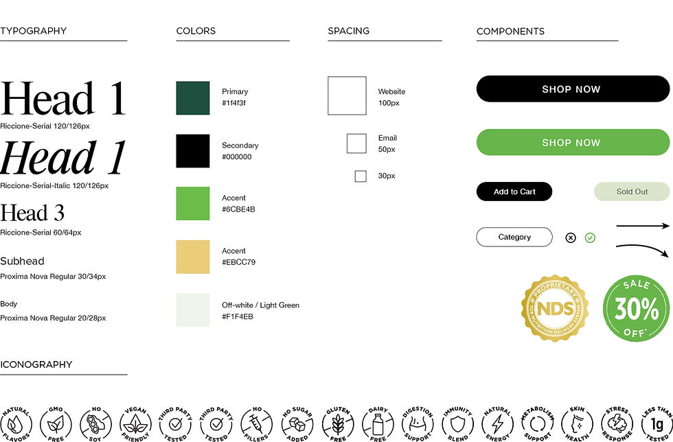

The palette was built around the hero product, YOR SuperGreens (spirulina, chlorella, wheatgrass, 30+ superfoods). Forest Green anchors the system with credibility and depth, appropriate for a brand with 17+ years in market. Leaf Green is the active energy of the brand, used on CTAs and anywhere we need to invite action. Gold is reserved strictly for the NDS badge and premium callouts. Off White keeps the system from going clinical.
The palette was also designed to scale across the full product line. The green system owns SuperGreens as the hero SKU, but the architecture has product-specific accent flexibility built in. YOR Berry Blast pulls a red accent that sits naturally alongside the forest palette, giving that product its own identity while staying unmistakably YOR Health.


AD CONCEPTS


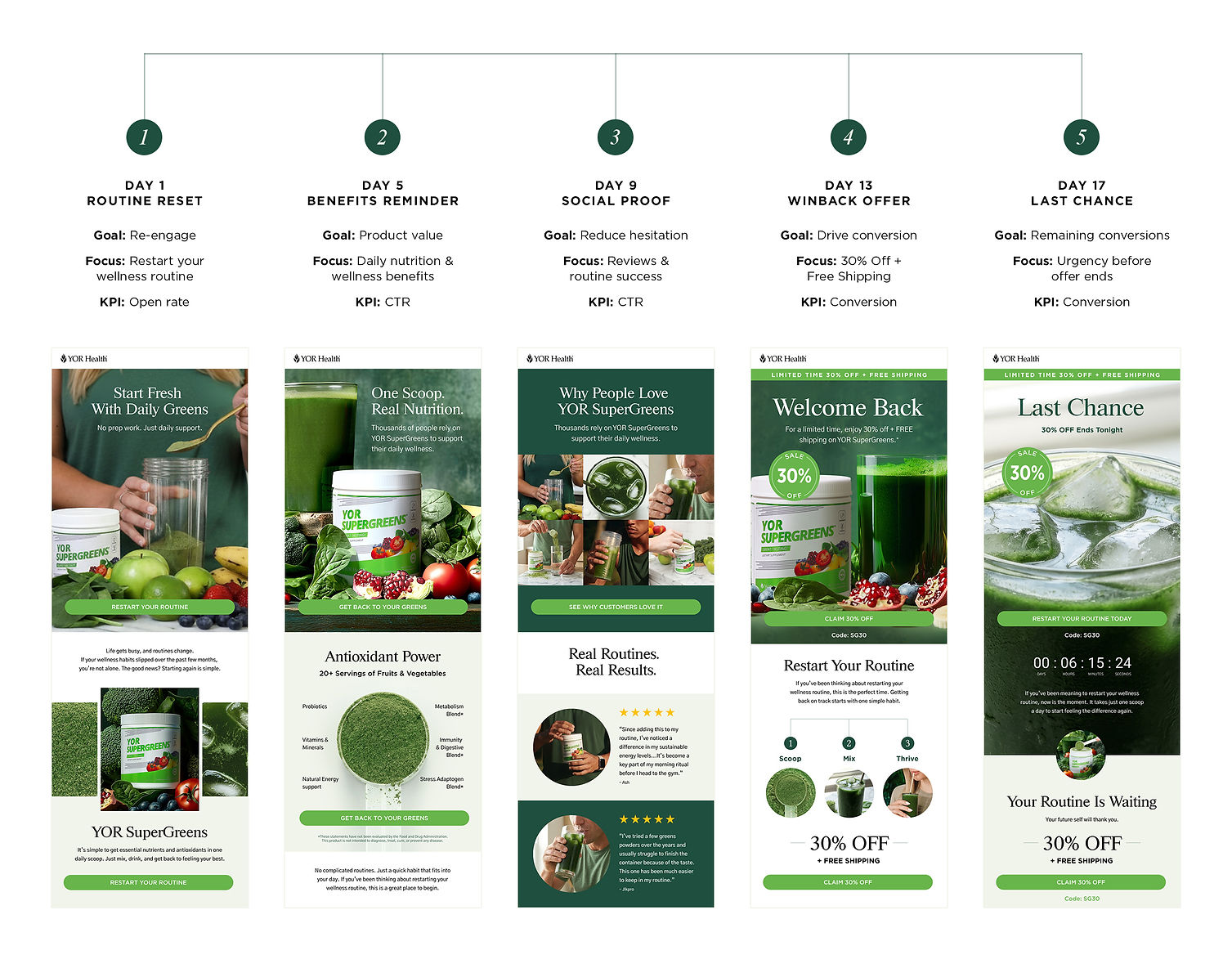
WIN-BACK EMAIL CAMPAIGN
Customers likely broke the habit, tried another product, or forgot their results.
Theme: Routine Reset
Goal: 2-4% conversion
Results:
Open Rate: 32%
CTR: 2.3%


AMAZON LAUNCH
In 2025, we launched YOR Health’s Amazon storefront, where I designed Product Detail Pages (PDPs) and Brand Store graphics that translated each product’s messaging and visual identity into a cohesive Amazon experience while maintaining strong brand consistency.


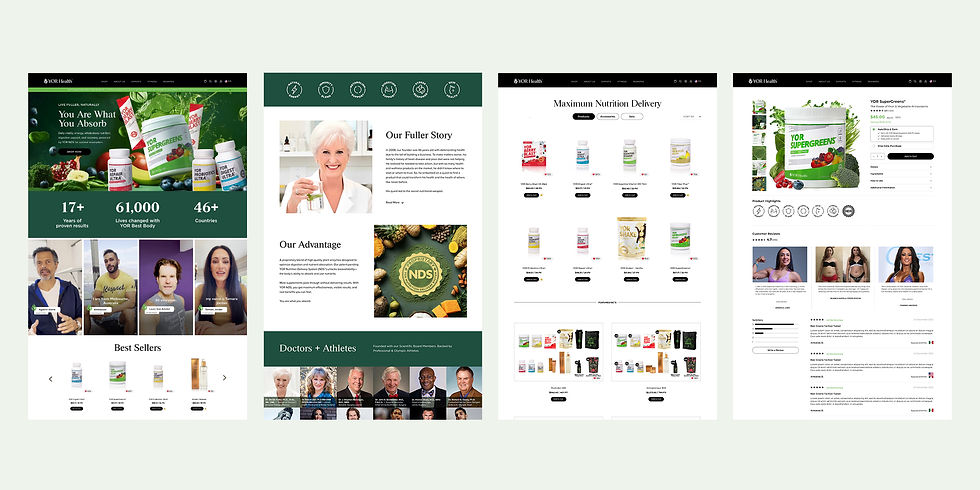
WEB UI UPDATES
I made strategic updates to improve the site’s UI for greater clarity and usability, and am currently redesigning the homepage while adding a customer review section.
I also designed various landing pages to support YOR Health's Opportunity platform.